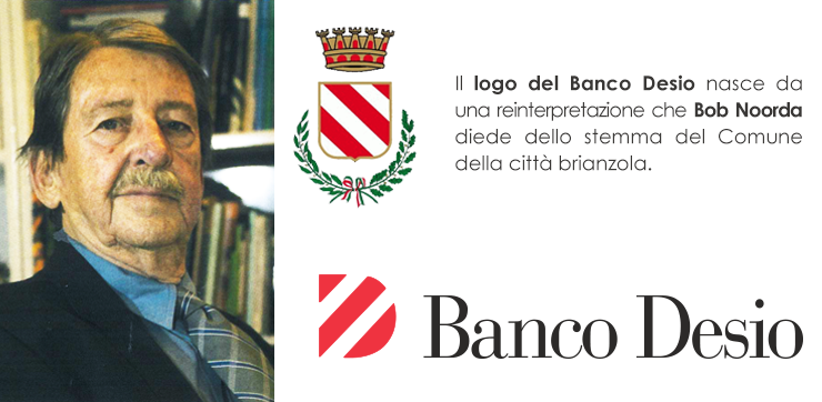
Bob Noorda and the new trademark
At almost thirty years of age, it has the same fresh look and visual impact of its first day: the Banco Desio trademark, with its famous red striped “D”, was designed by one of the leading names in the world of design, Bob Noorda (1927-2010).
Born in Amsterdam, Netherland, and working in Italy since the 50s, Noorda has been a graphic artist, designer, art director and architect, but mostly the creator of some of the most famous and memorable Italian and foreign logos: from Agip to Dreher, from Enel to Bormioli, from Mondadori to Feltrinelli, from the signage of Metropolitana di Milano (Milan subway) to that of New York and Sao Paolo, Brazil.
In an interview released for the Group's newsletter, La Banconota, in December 2006, Noorda tells the story of how the new logo was born:
“I believe it was 1985 or 1986. They told me that Banco Desio was a small local bank based in Desio and with offices/branches in Brianza, a company with strong roots in the territory. The trademark was supposed to convey this idea of a profound connection… I thought about the emblem of the city of Desio which I think I had seen printed on a municipal leaflet: a central shield with three beautiful diagonal red stripes. I liked it, I drew a quick sketch and at the Milan's studio I kept working on it. The best idea came when I took the shield and rotated it 90 degrees. I obtained an upper case “D” which I redesigned, adjusting the spaces and proportions while maintaining the diagonal red stripes. There it is, the “D” of Banco Desio. I had found the logo! I added the words “Banco Desio”, using a font I love very much, Bodoni. A beautiful, classical font, with a distinctive personality but also solid and “enduring” over time... as a bank should be”.